Online Award – Voting
Pick your favourite prototypes and help them win the Online Award and the €1,000 prize.
Online voting
Check out the best prototypes selected by our jury for this year’s MYP. Each stands out in design, sustainability, or selected topic. High School and Unlimited prototypes compete together.
- Vote for up to 3 prototypes by clicking the box in the top right corner.
- Submit the form at the bottom of the page to confirm your vote.
- One vote per person.
- Voting closes on 31 July at 23:59 CET.
The 28 prototypes are shown in random order. The winner receives the Online Award, 1000 EUR, and a nomination for the next round of Model Young Package. Additionally, a prototype with the second most votes will also be nominated for the next round.
The winners will be contacted in August and announced at the award ceremony in November.
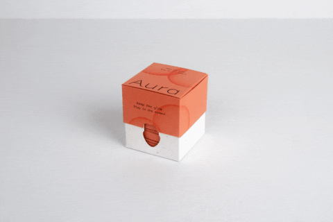
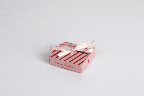
Aura. Stay in the moment.
Condoms
Magdalena Cieślak, Filip Jeziorowski (POL)
Pocket Aura bridges the gap between intimacy and reality, replacing unappealing waste with a graceful ritual. The design uses 350g Coffee Paper and CopperOrange tones to mimic the warmth of skin. The 5-pocket sliding system allows for discreet, aesthetic disposal anywhere-from home to nature. This "perfectly imperfect" set turns a functional necessity into a lifestyle object, breaking taboos by ensuring the end of your encounter is as beautiful as the start.
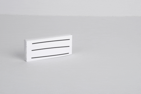
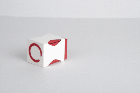
Unmask adhd
ADHD medication
Hyuga Kuramochi, Kaushik Manian, Tng How Rong Jayden (SGP)
Singapore Polytechnic
People with ADHD spend their lives masking. Here, a mask they can take off. Twice a day, for five days. Tear the perforated strip: a tab keeps it tethered, so the mask returns with every dose. Inside, an all-paper pill blister. Peel the glassine lid and each pill lifts up with it, plucked cleanly: no plastic to fight, no foil to tear, no pills flying everywhere. 300gsm card + glassine, fully recyclable. 10 pills, pocket-sized housing, discreet. A quiet package for a loud taboo. Just breathe.
INCON
Incontinence underwear
Marie Sýkorová (CZE)
Secondary Art School in Ostrava
Unpacking Taboo: Incontinence Incontinence affects people of all ages but remains a social taboo. This project explores how design can reduce stigma and improve everyday comfort. Inspired by an elegant handbag, the packaging is designed to feel discreet and refined. Its shape subtly references underwear, while simple folds and a clean structure ensure functionality. The soft aesthetic supports dignity, comfort, and ease.
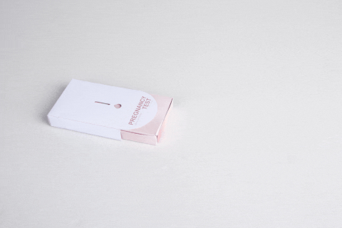
Subtlechech
Pregnancy test
Kinga Milcarz (POL)
The pregnancy test packaging breaks taboos by consciously departing from imposing emotions and stereotypical narratives. It does not suggest a reaction or judge – it creates a neutral, safe space for everyone. Discreet, cardboard, and visually unobtrusive, the packaging accompanies the user from the moment of purchase through taking the test, considering the entire experience process. Clear, convenient instructions guide step by step, offering support instead of pressure.
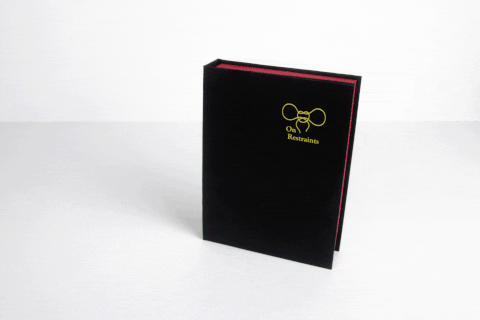
On Restraints
Sexual fetishism
Anna Łepak (POL)
Adam Mickiewicz University
A book-form packaging designed to normalize sexual fetishes through an educational, stigma-reducing approach. It combines a rope storage system with a concise publication, promoting safe, informed exploration grounded in knowledge, discretion, and material quality. Technologies: cutting, creasing, hot stamping, adhesive bonding. Materials: Color Style Recycling 270, Wibalin Finelinen 115, ESKAboard 2 mm. Social media promotion by researchers & sexologists as educational, introductory content.
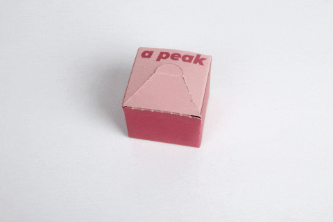
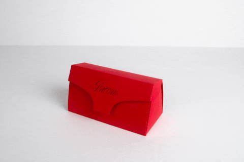
Reach a Peak
Condoms
Alesia Iurtcevich (POL)
“Reach a Peak” is a 12-condom pack that acts as a storage compartment with a dispenser. The inspiration for this packaging came from a plastic drugstore cosmetic dispenser. The package consists of two parts: the main part with a perforated triangular window on the front, and a paper “spring” inside, which is higher than the package height, providing the force to push the condoms upward.
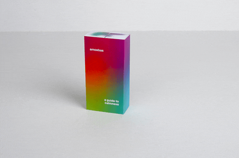
Amoebas – a Guide To Calmness
Anxiety medication
Aneta Smejkalová (CZE)
Tomáš Baťa University in Zlín
Anti-anxiety meds are often overused. This packaging offers a non-invasive alternative: eight endlessly flipping cubes made of paper joined by matte film. This haptic interaction naturally releases tension and delays the automatic reflex to take a pill. As the cubes turn, quick relaxation techniques are revealed. The compartments hold medication or candies. Featuring a pixelated amoeba design to reflect shifting emotions, it doubles as a subtle, socially accepted stress-relief toy.
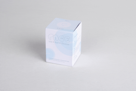
PACE
Menstrual cup
Shivika Chopra (IND)
RIT Croatia, Zagreb
Designed to reduce hesitation, the packaging acts as both container and learning tool. Its structure mimics female anatomy, enabling users to explore and practice before use. A layered unboxing guides interaction step by step, making the experience feel familiar yet purposeful, transforming a taboo product into something intuitive and approachable.
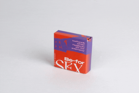
Be-for-Sex
Intimate hygiene
Ida Mihaica (CRO)
RIT Croatia, Zagreb
Be-for-Sex is a before-and-after hygienic intimacy kit that brings together physical and mental care by guiding users through moments of awareness, choice, and reflection before and after intimacy, containing essential products such as lubricant, condoms, and wipes.
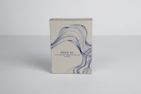
OPEN UP
Feelings sharing
Nela Folprechtová (CZE)
MICHAEL high school of advertising and art
A topic that is taboo across society and age groups, whether it be the younger or older generation, is the occasional problem of expressing one's emotions and feelings to others. Many individuals face barriers in direct verbal communication. Despite their efforts, they are unable to express themselves in words at that moment, so they look for alternative ways to open up to others and share their emotions and feelings without being exposed to the pressure of direct dialogue.
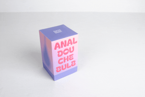
Anal Douche Bulb Package
Intimate hygiene
Dominik Bulejko (SVK)
Tomáš Baťa University in Zlín
The packaging design addresses the taboo of anal hygiene and preparation. It aims to destigmatize the topic through a sensitive and educational approach based on the idea that “Preparation is part of intimacy.” The two-piece paper box uses an exploding mechanism, unfolding into a flat surface with pictograms (prepare, fill, clean, relax) instead of text instructions. Soft purple and skin-tone colors evoke intimacy and care. The packaging becomes both a protective and educational tool.
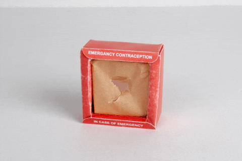
Emergency Contraception Box
Contraception
Johan Elmdahl (SWE)
This project looks at how emergency contraception can be presented more clearly through packaging. Instead of being discreet or easy to overlook, the design uses the familiar “break glass in case of emergency” format, something people already understand as a backup for when things go wrong. The package is a small, frame-like box with a recessed front. A translucent paper layer sits in the center, marked with a target. To access the contents, the user punctures this surface. The action is simple and direct, making the purpose of the product immediately clear. The red color and bold typography are taken from emergency signage, helping the package stand out and feel easy to read at a glance. At the same time, it is made as a folding carton, so it remains practical to produce. The aim is to present emergency contraception as something straightforward and reliable, to get rid of the taboo around it.
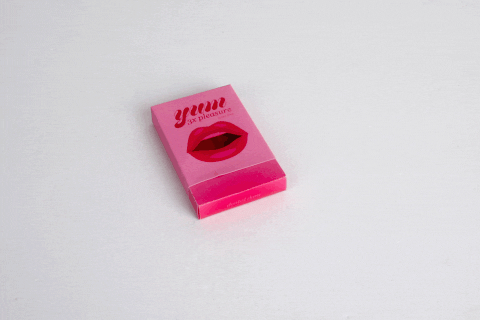
Yum
Dental dams
Antonia Moser, Yasmina Wiehle (GER)
“yum” is a paper-based packaging concept for flavored dental dams that focuses on reducing stigma through design. A playful outer sleeve, shaped like a stylized mouth, creates a surprising unboxing: what first appears as a tongue reveals individually wrapped dental dams with vulva graphics. The minimal sliding structure is intuitive, hygienic, and easy to use. Bold visuals and compact size make the product approachable, portable, and conversation-starting.
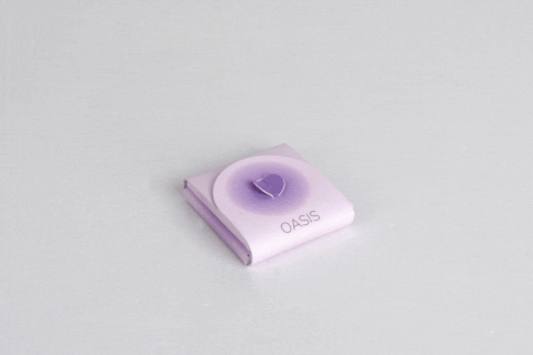
OASİS
Morning-after pill
Zeynep Özbıyık (TUR)
This project redefines morning-after pill packaging as an empathetic interface rather than a passive container. It addresses stress and anxiety by guiding the user through a layered unboxing experience with reassuring messages. Instructions and key information are integrated into the structure, supporting use directly. With a minimal and calm visual language, the design reduces cognitive load and transforms a moment of uncertainty into a more supported and human experience.
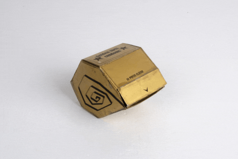
Golden Shell
Condoms
Adéla Hečková (CZE)
Secondary School of Mechanical Engineering and Arts in Opava
Unboxing experience - The user opens a small hole in the paper box, grabs the paper arrow and then tears off one or more condoms as needed. Simplicity and minimization of the main functions - My intention was to design a package that can hold as much content as possible in a minimum space. The package is designed to be easy to store. Design, graphics and overall aesthetics - The shape of the shell refers to the fact that the product is designed as a "reservoir", ideal for travel.
Balls
Kegel balls
Veronika Dyršmídová (CZE)
Arts School of musical instruments and furniture in Hradec Králové
A box for Kegel balls that I chose because I feel like products associated with female private parts are not talked about enough. It is easily opened by tearing on one side, revealing the inner folded structure. Inside, there are cut-out shapes designed to securely hold them in place. One side features the bigger part of the balls. For design I chose to spray the box from brown recycled paper to vivid pink because it feels feminine with text that contains the shape of the balls.
With Love
Condoms
Zuzana Minaříková (CZE)
Private Higher Vocational School of Graphic Design and Secondary School of Art in Jihlava
For my project, I chose condoms. I designed a product aimed at women. I find that there are not enough subtly and femininely looking sexual products on the market. I chose a classic girly color combination - pink and red. I associate these colors with femininity. The box works like a tie, so nothing needs to be glued, which could potentially make mass production easier.
Flow Cup
Menstrual cup
Eliška Zmítková (CZE)
Arts School of musical instruments and furniture in Hradec Králové
I designed packaging for a menstrual cup that serves for its safe and hygienic storage. The construction is based on a simple closed form. When opened, the package dynamically unfolds and creates a short moment of surprise. This movement can symbolically reflect natural processes of the female body. Side cut-outs refer to female anatomy. The aim of the design is to make handling the product more pleasant and to bring a small positive moment to the user.
Memory Box
Memories of the lost ones
Nikola Bartošová (CZE)
Secondary Art School in Ostrava
This package is designed for memories on loved person. It can helps to solve a feeling of loss. Box is neutral made to suit everyone and it tells a story about lifetime and memory. And the mark a person leaves behind. It can be used at the farewell ceremony. In the lid is removable space for photos and the box is split over two floors. Upper floor is primarily meant for a set of things which that can be used to say goodbye. And second floor is free space for personal items.
BLOOM
Menstrual pads
Hanna Bober (POL)
Bydgoszcz University of Science and Technology in Bydgoszcz
BLOOM is a packaging concept for menstrual products that combines convenience, aesthetics, and discretion. The cardboard box, featuring a dispenser and a system of flat envelopes, makes storage and use easy. The envelopes serve a dual purpose—they are used both for storing pads and for their hygienic disposal. The design reduces plastic, supports sustainability, and breaks the taboo surrounding menstruation, introducing a more open and comfortable approach to everyday life.
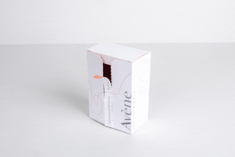
Avéne Cold Cream And Gloves Set
Eczema care
Pavlína Ondrušová (CZE)
Secondary Art School in Ostrava
I would love to present my package for eczema-prone skin. Inspired by seeing a woman hiding her irritated hands, I designed a set with cream and overnight gloves to improve absorption. The packaging evokes dry, cracking skin through a ripping strip. It is simple, elegant, and manufacturing-friendly, made from one piece with minimal gluing, using clean white and orange graphics.
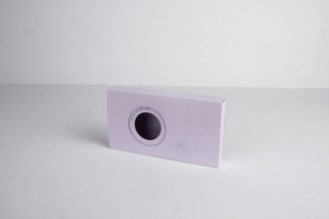
Alopecia Care Package
Alopecia cap
Veronika Jalůvková (CZE)
Secondary Art School in Ostrava
Practical packaging for a cap highlighting the sensitive topic of alopecia. The aim is to raise public awareness of this disease. It is a simple folding box with a window that reveals the cap inside. The front features a minimalist line graphic symbolizing hair, forming a hummingbird – the logo of the organization Kolibříci pomáhají, a symbol of joy, uniqueness, love and healing. Pastel colours softly complement the product and create the impression of an elegant gift package.
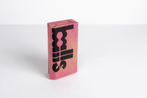
SEX ISN´T TABOO, TALKING ABOUT IT IS
Condoms
Jan Pilař (CZE)
Secondary School of Tourism and Graphic Design in Pardubice
For the theme "UNPACKING TABOO," I chose a condom box. I created my box not only with provocative graphics, but also with a very playful design. It consists of four parts made from a single piece of paper. Opening and closing them allows you to move the individual parts and completely change the appearance of the box. The goal is to spread information about the issues depicted on the box and also to open communication between people. The box also includes an educational sex game.
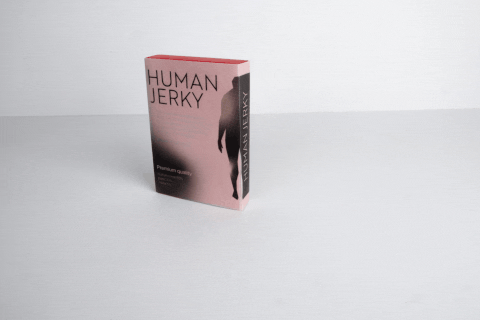
Human Jerky
Organisms extinction
Darja Bulavka (CZE)
Secondary Art School in Ostrava
Packaging that tells a story in itself. This design is a concept for packaging from the near future. The dystopian atmosphereis enhanced by non-standard papers with a leather and plastic texture.
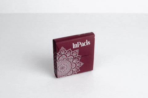
InPads
Menstrual pads
Terezie Rachvalová (CZE)
Strážnice High School
The whole project started with one thought. For example, what would help me personally in my everyday life?That's why I came up with a box that can help with this. The box is designed for storing menstrual pads. It is spacious enough for up to 5 pads.The box is made mostly of one piece of paper. The wine color gives an elegant look and its structure creates an interesting overall effect. The created mandala serves as a graphic element.UV printing in white was chosen for the printing.
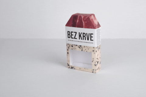
BLOODLESS (BEZ KRVE) – Tofu Packaging with a Visual Twist
Meat alternative
Adam Kiršner (CZE)
Secondary Art School in Ostrava
"BLOODLESS" (BEZ KRVE) is a paper packaging concept for 2x180g. It uses radical visual contrast to confront dietary habits: the top half features a raw meat print, while a bottom window reveals the real plant-based product inside. A central sliding sleeve with bold typography unites the design. Sliding it off reveals a hidden activist text about the meat industry. The packaging transcends basic protection to become a provocative, interactive medium.
FOR US-We Play Together
Sexual education
Natálie Křístková (CZE)
Secondary Art School in Ostrava
The packaging is a layered system of three sliding cardboard sleeves placed inside a rigid flip-top box. Made of high-grammage metallic cardboard, it combines digital print, plotter cutting and hot foil stamping for a refined tactile effect. The sequential opening builds emotional intensity, symbolizing trust and intimacy. The packaging becomes part of the experience and supports premium positioning and limited editions.
Thatone!
Hemorrhoid care
Tomasso Ceschi (ITA)
The packaging project was created to make the purchase of hemorrhoid and anal fissure products more discreet, addressing the taboo and embarrassment around these conditions. Graphics, naming, and structure all support this single goal. A red-to-blue gradient suggests healing without explicit references, while the name avoids direct mention of the issue. The unboxing is designed as a private, gradual experience, and a simple structural fold ensures anonymity and discretion.